Visualization Challenge 2: Is College Still Worth It?
Introduction
As the cost of college (and everything else….) continues to rise, students and their families are increasingly concerned about the return on investment of a college degree. The question becomes: “Is the cost of going to college worth it when considering future earnings potential?”
The following graphic was posted on reddit to help illustrate this:
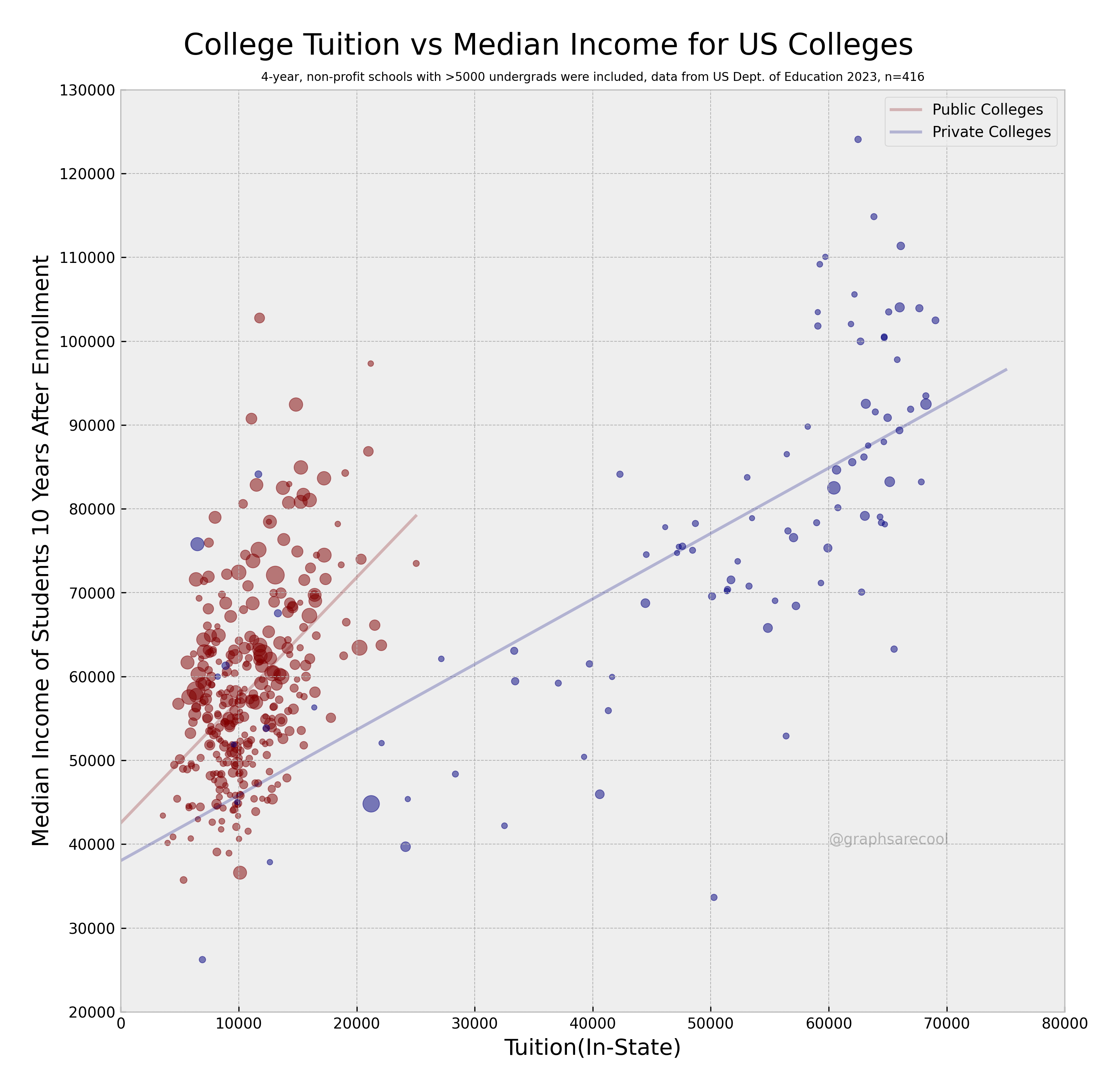
In this particular graphic :
- The size of the dots represents the number of students enrolled at each institution. The larger the dot, the larger the student body.
- The color of the dots represents whether the institution is public (red) or private (blue)
- The y-axis represents median earnings 10 years after entry into the workforce
- The x-axis represents the cost of in-state tuition
- A linear model is added for both public and private institutions to help illustrate the trend
Finding the Data
The data for this visualization comes from the College Scorecard.
The data set we want to use is Most Recent Institution-Level Data. It can be found on this website and downloaded here. The name of the download should be Most-Recent-Cohorts-Institution_05192025.csv.
This data set contains information on over 7,000 institutions of higher education in the United States. There are also over 3000 variables in this data set. That is a lot of variables that we will need to comb through in order to find the relevant data. What can help us find what variables we need can be found in what is called a data dictionary.
A data dictionary is a document that describes the variables in a data set. It can help us find the variables we need for our visualization. The data dictionary can be found on the same page as the data set and can be found by clicking on the DATA DOCUMENTATION tab at the top of the page.
Once you click on this tab, you will find the file you can download. It is called Data Dictionary, however, you want the technical documentation that is called Institution-Level Data Files and is an pdf file. You can download it here. You should be able to open this file and start reading through it.
In order to recreate this graphic, we will need to have the same data they used to create it. For this exercise, we want to filter out the following variables in the data set (Hints are given to help find the appropriate variables):
- Institution Name (INSTNM)
- Institution City (CITY)
- Institution State (STABBR)
- Median earnings 10 years after entry into the workforce. (Read through the data dictionary to find the appropriate variable name)
- Cost of in-state tuition (Contains “TUI”)
- Type of institution : public or private. (Contains “CONTR”)
- Type of institution : 4-year or not (ICLEVEL)
- Number of students enrolled (UGDS)
Loading the Data
The first challenge we have is to load the data into R. The data set is quite large and may take a few moments to load.
# If needed, read in tidyverse so we can use read_csv

library(tidyverse)

# Read in the data set.

df <- read_csv("Most-Recent-Cohorts-Institution_05192025.csv")
Notice there are 3306 different variables in this data set! You will need to open the data dictionary in a spreadsheet and look for the appropriate variables.
The next step is to pull out the appropriate variables.
# Filter the data set to get the appropriate variables. Fill in the blanks!

df2 <- df %>%
  select(INSTNM, CITY, STABBR, contains(______), contains(______), ICLEVEL, UGDS, ___________)
view(df2)
If all went well, you should have the variable df2 that has 6429 observations with 12 variables. Using df2 you should be able to start recreating the graphic above!
Another hint : Make sure you read the subtitle of the graphic.
Note : The graphic is from 2023 data, but the information has been updated. The data dictionary did not change, but the amount of entries did change. There should be 490 schools in your filtered data set. This means you need to update the subtitle.
Good luck!
Solution
For this graphic, we need the following :
- Create a scatter plot of Tuition (TUITIONFEE_IN) Vs Median Earnings 10 Years After Entry (MD_EARN_WNE_P10)
- Have the size of the dots be based on the number of undergraduates
- set the alpha to 0.5
- have the y-axis use values 20000 to 130000 with gridlines every 10000
- have the x-values go from 0 to 80000
- have public colleges be red and private colleges be blue
- have there be no minor grid lines
- have the background be a very light gray
- remove the key for the size of the dots
- add a linear model for public and private with no standard error and alpha = 0.5
- extend then private college linear model out to x = 75000
- have breaks every 10000 on the x-axis
- add black tick marks on both axes
- on the visualization have the x-axis start at 0 and the y-axis start at 20000
- Y-axis label = “Median Income of Students in 10 Years After Enrollment”
- X-axis label = “Tuition (In-State)”
- Title = “College Tuition vs Median Income for US Colleges” and centered on graphic
- subtitle = “4 Year, non-profit schools with > 5000 undergrads were included, data from US Dept. of Education 2025, n = 490” and make the font very small and centered on graphic
- in the far upper right hand corner of the graph, add text that says “Private Colleges (Blue)” and “Public Colleges (Red)” below it and locate it at x = 65000 and y = 128000
# Read in the data
df <- read_csv("Most-Recent-Cohorts-Institution_05192025.csv")

# Notice there are 6429 observations and 3306 variables!

# Filter out the columns we need. You can get the names and descriptions
# from the data dictionary :

# Insitution Name (INSTNM)
# Institution City (CITY)
# Institution State (STABBR)
# Median earnings 10 years after entry into the workforce (MD_EARN_WNE_P10)
# Cost of in-state tuition want variables that contains "TUI")
# Type of institution : public or private : Need variables that contains "CONTR"
# Type of institution : 4-year or not (ICLEVEL)
# Number of students enrolled (UGDS)

df2 <- df %>%
  select(INSTNM, CITY, STABBR, contains("TUI"), contains("CONTR"), ICLEVEL, UGDS, MD_EARN_WNE_P10)

# We have cut this down to 6429 obersvations and 12 variables.

view(df2)

# Filter out Private Colleges. This is when CONTROL = 2
# This should give us 1953 observations

Private_Colleges <- df2 %>%
  filter(CONTROL == 2)

# Filter out Public Colleges. This is when CONTROL = 1
# This should give us 2056 observations

Public_Colleges <- df2 %>%
  filter(CONTROL == 1)

# Filter out private schools with more than 5000 undergraduates.
# This should cut Private the list down to 102 observations.

Private_College_5000 <- Private_Colleges %>%
  filter(UGDS > 5000)

# Filter out public schools with more than 5000 undergraduates
# This should cut Public the list down to 600 observations.

Public_College_5000 <- Private_Colleges %>%
  filter(UGDS > 5000)

# Filter out 4-year schools (ICLEVEL == 1)

Private_College_5000 <- Private_College_5000 %>%
  filter(ICLEVEL == 1)

# This should have removed one Private school and there are now 101 observations.

Public_College_5000 <- Public_College_5000 %>%
  filter(ICLEVEL == 1)

# This should have removed several Public schoola as there are now 389 observations.

# This gives us 490 schools to plot.

ggplot() +
  geom_point(data = Private_College_5000, aes(x = TUITIONFEE_IN, y = MD_EARN_WNE_P10, size = UGDS), color = "blue", alpha = 0.5) +
  geom_point(data = Public_College_5000, aes(x = TUITIONFEE_IN, y = MD_EARN_WNE_P10, size = UGDS), color = "red", alpha = 0.5) +
  scale_y_continuous(limits = c(20000, 130000), breaks = seq(20000, 130000, by = 10000)) +
  scale_x_continuous(limits = c(0, 80000), breaks = seq(0, 80000, by = 10000)) +
  theme_minimal(base_size = 15) +
  theme(
    panel.grid.minor = element_blank(),
    panel.background = element_rect(fill = "lightgray"),
    legend.position = "none",
    axis.ticks = element_line(color = "black")
  ) +
  geom_smooth(data = Private_College_5000, aes(x = TUITIONFEE_IN, y = MD_EARN_WNE_P10), method = "lm", se = FALSE, color = "blue", alpha = 0.5, fullrange = TRUE) +
  geom_smooth(data = Public_College_5000, aes(x = TUITIONFEE_IN, y = MD_EARN_WNE_P10), method = "lm", se = FALSE, color = "red", alpha = 0.5) +
  labs(
    y = "Median Income of Students in 10 Years After Enrollment",
    x = "Tuition (In-State)",
    title = "College Tuition vs Median Income for US Colleges",
    subtitle = "4 Year, non-profit schools with > 5000 undergrads were included, data from US Dept. of Education 2025, n = 490"
  ) +
  theme(
    plot.title = element_text(hjust = 0.5),
    plot.subtitle = element_text(hjust = 0.5, size = 8)
  ) +
  annotate("text", x = 65000, y = 128000, label = "Private Colleges (Blue)\nPublic Colleges (Red)", hjust = 0)
Note that we could have done all of the filtering using a single command :
Private_College_5000 <- df2 %>%
  filter((CONTROL == 2) & (UGDS > 5000) & (ICLEVEL == 1))

Public_College_5000 <- df2 %>%
  filter((CONTROL == 1) & (UGDS > 5000) & (ICLEVEL == 1))