# Response 1Individual Lab 4.
Dataset : okcupid_profiles.csv
The data consists of the public profiles of 59,946 OkCupid users who were living within 25 miles of San Francisco, had active profiles during a period in the 2010s, were online in the previous year, and had at least one picture in their profile. Using a Python script, data was scraped from users’ public profiles four days later; any non-publicly facing information such as messaging was not accessible.
For a complete list of variables and more details, see the accompanying codebook okcupid_codebook.txt .
Instructions : You are expected to comment throughout your R script, writing out the question, your analysis, and answer any questions that were asked. For your visualizations, you are expected to try several different variations until you find one that you feel best answers the question. Do not settle for a basic graphic. Add labels, change colors, add textures, etc.
- Load the CSV data set into a variable called “Cupid1”.
- Height is one of three numerical variables in the data set. What are the other two?
# Response 2- Investigate the overall heights of the individuals using the
favstats( )function. It can be found in the mosaic package, if it is not loaded up. (Don’t forget the quotation marks about the name of the package!) Here is the syntax :
favstats( ~ variable_name, data = data_set)
So if we wanted to investigate the age variable in Cupid1, we would type :
favstats( ~ age, data = Cupid1)
which should lead to something like this :

# Response 3- Do a similar investigation for the heights variable. Briefly explain your findings. Do you have any concerns about the results?
# Response 4
If we think there are issues with some of the data, then it is possible to remove some of the data points from our set. For example, assume we have a data set where we want to only use the IQ scores between 100 and 150. We can use the filter( ) command to do this for us. This command comes from the dplyr package.
We could use the following command to filter our data set :
New_Data <- filter(Old+Data, IQ >+100 & IQ <=150)
- Using the
filter( )command, create a new data set called “Cupid2” that only uses heights between 55 and 80 from Cupid1. Does the new data set only have the heights or did it keep all the other variables?
# Response 5- How do the heights of female and male OkCupid users compare? - Create a histogram for the heights variable in Cupid2 using gplot. - Create a boxplot for female and male heights using ggplot. (Hint : If needed, use the
fiklter( )command to create two new variables, “Female_Data” and “Male_Data”.) - Create a graph with both boxplots at the same time. (Hint : Here ) - Add astripchart( )to the boxplots. Is this useful? Explain.
# Response 6
Let’s look at a different way to make histograms. The histograms we made in class allowed us to create a plot but were limited to only creating the histogram from the point of view of a single variable. It would be nice to create a histogram that can have a single variable broken into different parts based on a secondary variable. For instance, can we create a histogram that will take all of the heights and break them into male and female groups for us? (Yes, it may be possible to do this with the ggplot( ) command, but this is a cool way, too.)
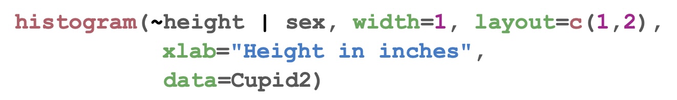
We compare the distributions of male and female heights using histograms. While we could plot two separate histograms without regard to the scale of the two axes, we instead use the histogram( ) function from the mosaic package to:
Plot heights given sex by defining the formula:
~ height | sex.Plot them simultaneously in a lattice consisting of two rows and one column of plots by setting
layout = c(1,2)Plot them with bin widths matching the granularity of the observations (inches) by setting
width = 1
The histogram( ) function automatically matches the scales of the axes for both plots.
- Using a variation of the command above, create and customize a histogram each for female and male heights.
# Response 7These first exercises stress many important considerations students should keep in mind when working with real data. Firstly, it emphasizes the importance of performing an exploratory data analysis to identify anomalous observations and confronts students with the question of what to do with them. For example, while a height of 1 inch is clearly an outlier that needs to be removed, at what point does a height no longer become reasonable and what impact does the removal of unreasonable heights have on the conclusions? In our case, since only a small number of observations are removed, the impact is minimal.
Secondly, this exercise demonstrates the power of simple data visualizations such as histograms to convey insight and hence emphasizes the importance of putting careful thought into their construction. In our case, while having students plot two histograms simultaneously in order to demonstrate that males have on average greater height may seem to be a pedantic goal at first, we encouraged students to take a closer look at the histograms and steered their focus towards the unusual peaks at 72 inches (6 feet) for males and 64 inches (5’4”) for females. Many of the students could explain the phenomena of the peak at 72 inches for men: sociological perceptions of the rounded height of 6 feet. On the other hand, consensus was not as strong about perceptions of the height of 5’4” for women.