In this lesson, we will. talk about factors in R and how we can use them to help us with our data analysis. Factors are a data structure in R that are used for categorical variables. Sometimes these factors can have some type of order to them, such as “freshman”, “sophomore”, “junior”, and “senior” when it comes to year levels in school. Other times, they may not have an order, such as “red”, “blue”, and “green” when it comes to colors.
Factors are important because they allow us to work with categorical data in a way that is efficient and easy to understand. They also allow us to create visualizations that are easy to interpret. Factors are also used in statistical models to help us understand the relationships between categorical variables and other variables in our data.
We want to load up tidyverse as it has the forcats package. This stands for “FOR CATegorical variableS” and is used to work with factors.
library(tidyverse)
Warning: package 'ggplot2' was built under R version 4.5.2
── Attaching core tidyverse packages ──────────────────────── tidyverse 2.0.0 ──
✔ dplyr     1.1.4     ✔ readr     2.1.5
✔ forcats   1.0.0     ✔ stringr   1.6.0
✔ ggplot2   4.0.1     ✔ tibble    3.3.0
✔ lubridate 1.9.4     ✔ tidyr     1.3.1
✔ purrr     1.2.0
── Conflicts ────────────────────────────────────────── tidyverse_conflicts() ──
✖ dplyr::filter() masks stats::filter()
✖ dplyr::lag()    masks stats::lag()
ℹ Use the conflicted package (<http://conflicted.r-lib.org/>) to force all conflicts to become errors
You can see from the output that we have loaded up the forcats package, as well as some other packages that we will be using in a bit.
To get started, let’s create a data frame with some data. We are going to create some random data for high school students, including their student id, year level, and GPA. We are going to do some data analysis based on their year in school, so let’s create a vector that has the factor levels we want to use. In this case, the factors are fairly obvious:
we will be creating a tibble that has 30 entries using a student id number, year level, and gpa. In order for the work to be consistent each time we run the code,we will set a seed for reproducibility. This will give us the same random values every time we run the code. This is useful for you to check your work against mine. Once you are comfortable, you can change the seed to anything you want. If you don’t use a seed, the data will be different each time you run the code.
set.seed(1780)
We are now ready to create our data frame. We will use the tibble() function which came from the tidyverse package we loaded up above. We will pick random values with :
student id between 635894 and 985239
sample(seq(635894, 985239), 30)
the year level from the year_names vector
sample(year_names, 30, replace = TRUE)
gpa from a normal distribution with a mean of 3 and a standard deviation of 0.5, rounded to 2 decimal places.
We can see that student_id is listed as a double (numeric value) and gpa is also a double, while year_level is listed as a character vector.
Do these make sense? Yes, but it could be better.
student_id is a numeric value but it is a unique identifier for a student. We won’t be doing any kind of math with this number, so it could be a character vector as well. Let’s turn it into a character variable.
We can see that student_id is now a character vector.
Example 1 - A Bar Plot with Grouped Data
Now let’s look at year_level.
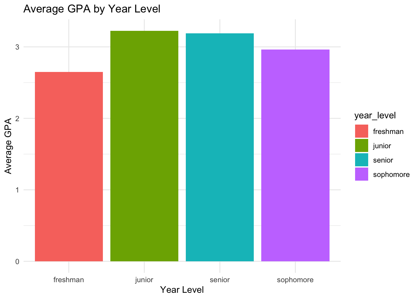
Let’s make a bar chart where the x-axis is year_level and the y-axis is average gpa of each year_level.
student_data |>group_by(year_level) |>summarise(avg_gpa =mean(gpa)) |>ggplot(aes(x = year_level, y = avg_gpa,fill = year_level)) +geom_col() +labs(title ="Average GPA by Year Level",x ="Year Level",y ="Average GPA") +theme_minimal()
When we create this graph, the x-axis is ordered alphabetically. This is because year_level is a character vector. We want to order it by the ACTUAL year level, so we need to convert it to an ordered factor.
Example 2 - Creating an Ordered Factor
We can see that the year_level is a character vector but it has a clear ordinal representation we could use : Fresh < Soph < Junior < Senior. Let’s convert it to a factor. We can do this with the factor() function.
We need to determine the order that we want to place on the factor. We can do this by using creating a vector that has the order we want.
(You will need to re-run the code that created the initial data frame to avoid any errors. After all, we changed the structure of the data frame.)
The first way is probably best as it would be easier to change the parameters if we wanted to change the order of the factor, especially if we have to use that order in multiple places.
Also note that forcats will tell you if there is a value in our data that is not in the factor. This is useful if you have a typo or a value that is not in the factor.
What if we forgot to put freshman in our ordering?
Error in `mutate()`:
ℹ In argument: `yearlevel = fct(year_level, c("sophomore", "junior",
  "senior"))`.
Caused by error in `fct()`:
! `x` must be a character vector, not a <factor> object.
Depending on the command you use, it may not throw an error, but it will turn those values into “NA” values.
NOTE : Re-run the commands to make sure there are no errors.
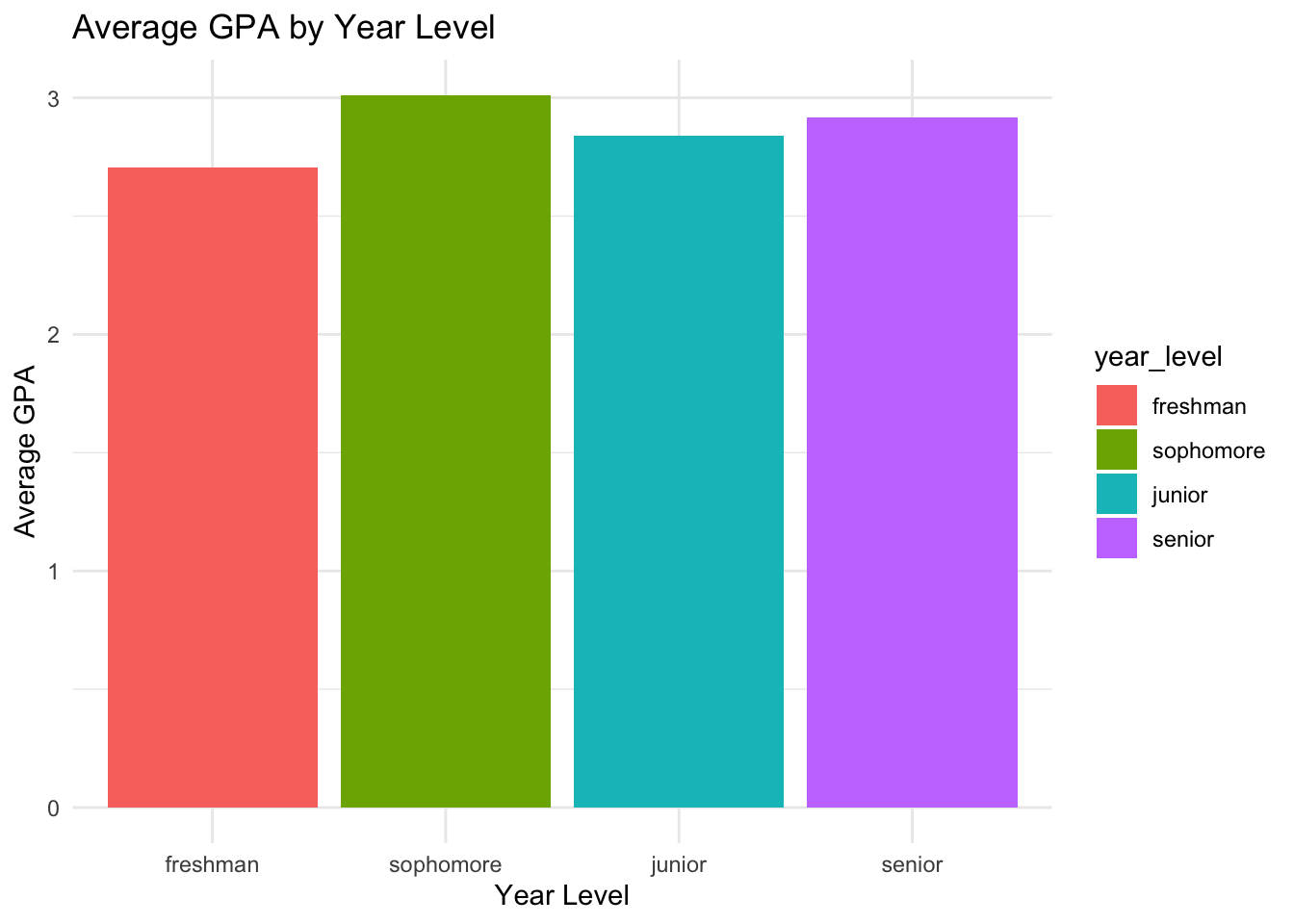
Example 3 - A Bar Plot with an Ordered Factor
We can now make a graph with the appropriate order on the x-axis:
student_data |>group_by(year_level) |>summarise(avg_gpa =mean(gpa)) |>ggplot(aes(x = year_level, y = avg_gpa,fill = year_level)) +geom_col() +labs(title ="Average GPA by Year Level",x ="Year Level",y ="Average GPA") +theme_minimal()
We can see that the x-axis is now ordered by year_level.
The order of the legend come from the “fill” aesthetic, so it is also ordered by year_level.
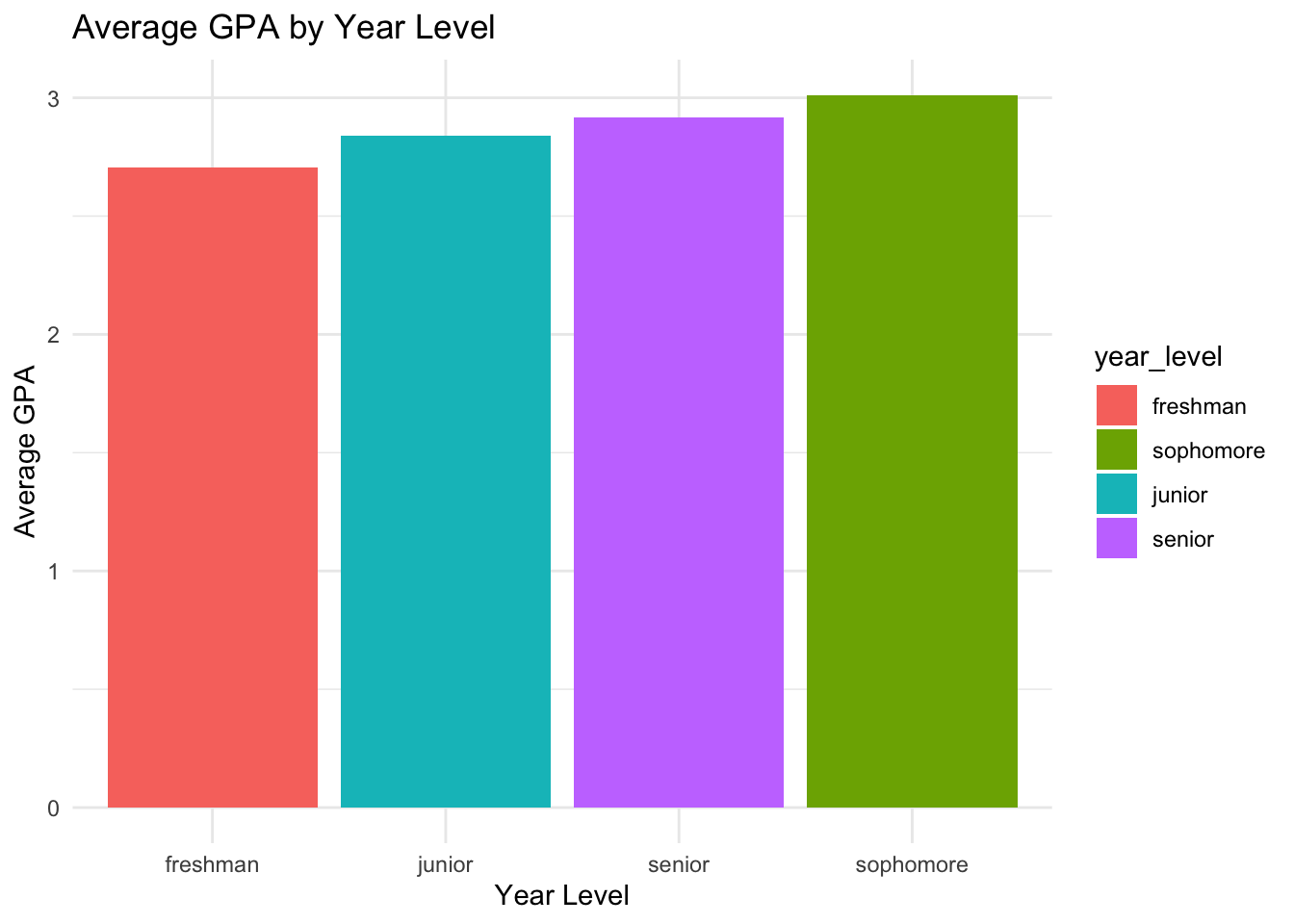
Example 4 - Reordering a Factor by Another Variable
What if we wanted the plot to go from lowest to highest GPA?
We would need to change the order of the factor to be based on the average GPA. We can do this with the fct_reorder() function.
The syntax for fct_reorder() is as follows:
fct_reorder(factor, order_by)
In this case, we want to reorder the year_level factor by the average GPA, so we need to calculate the average GPA for each year level first and then use that to reorder the factor.
We could do this outside of the ggplot( ) function, but it is easier to do it inside the ggplot( ) function.
To reiterate what was said above in relation to the legend, what if we don’t change how the legend is ordered? The legend will still be ordered by the original order of the factor, which is alphabetical.
student_data |>group_by(year_level) |>summarise(avg_gpa =mean(gpa)) |>ggplot(aes(x =fct_reorder(year_level, avg_gpa), y = avg_gpa,fill = year_level)) +geom_col() +labs(title ="Average GPA by Year Level",x ="Year Level",y ="Average GPA") +theme_minimal()
The graph is now ordered by the average GPA, but the legend is still ordered alphabetically. We need to change the fill aesthetic to use the reordered factor.
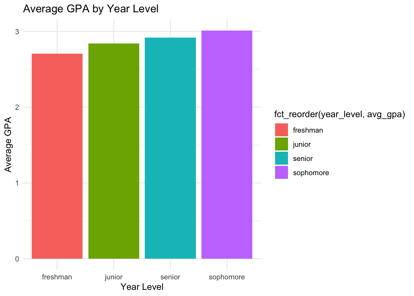
student_data |>group_by(year_level) |>summarise(avg_gpa =mean(gpa)) |>ggplot(aes(x =fct_reorder(year_level, avg_gpa), y = avg_gpa,fill =fct_reorder(year_level, avg_gpa))) +geom_col() +labs(title ="Average GPA by Year Level",x ="Year Level",y ="Average GPA") +theme_minimal()
Now the legend is also ordered by the average GPA.
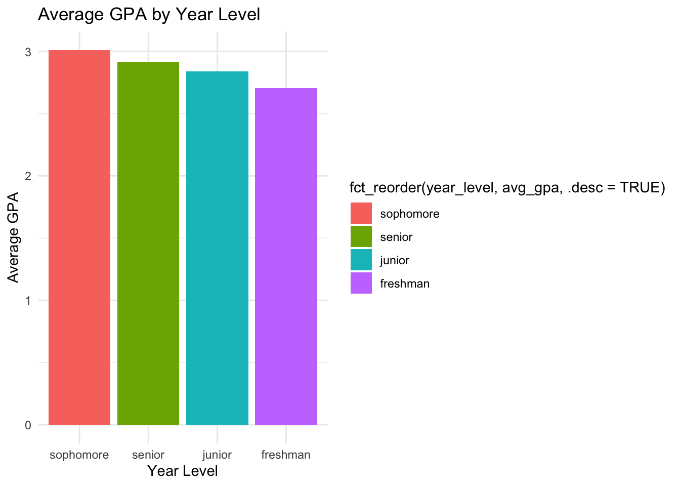
We can also use the fct_reorder() function to reorder the factor by the average GPA in descending order. We can do this by adding a .desc = TRUE in the fct_reorder() function.
student_data |>group_by(year_level) |>summarise(avg_gpa =mean(gpa)) |>ggplot(aes(x =fct_reorder(year_level, avg_gpa, .desc =TRUE), y = avg_gpa,fill =fct_reorder(year_level, avg_gpa, .desc =TRUE))) +geom_col() +labs(title ="Average GPA by Year Level",x ="Year Level",y ="Average GPA") +theme_minimal()
Now the x-axis is ordered by the average GPA in descending order, and the legend is also ordered by the average GPA in descending order.
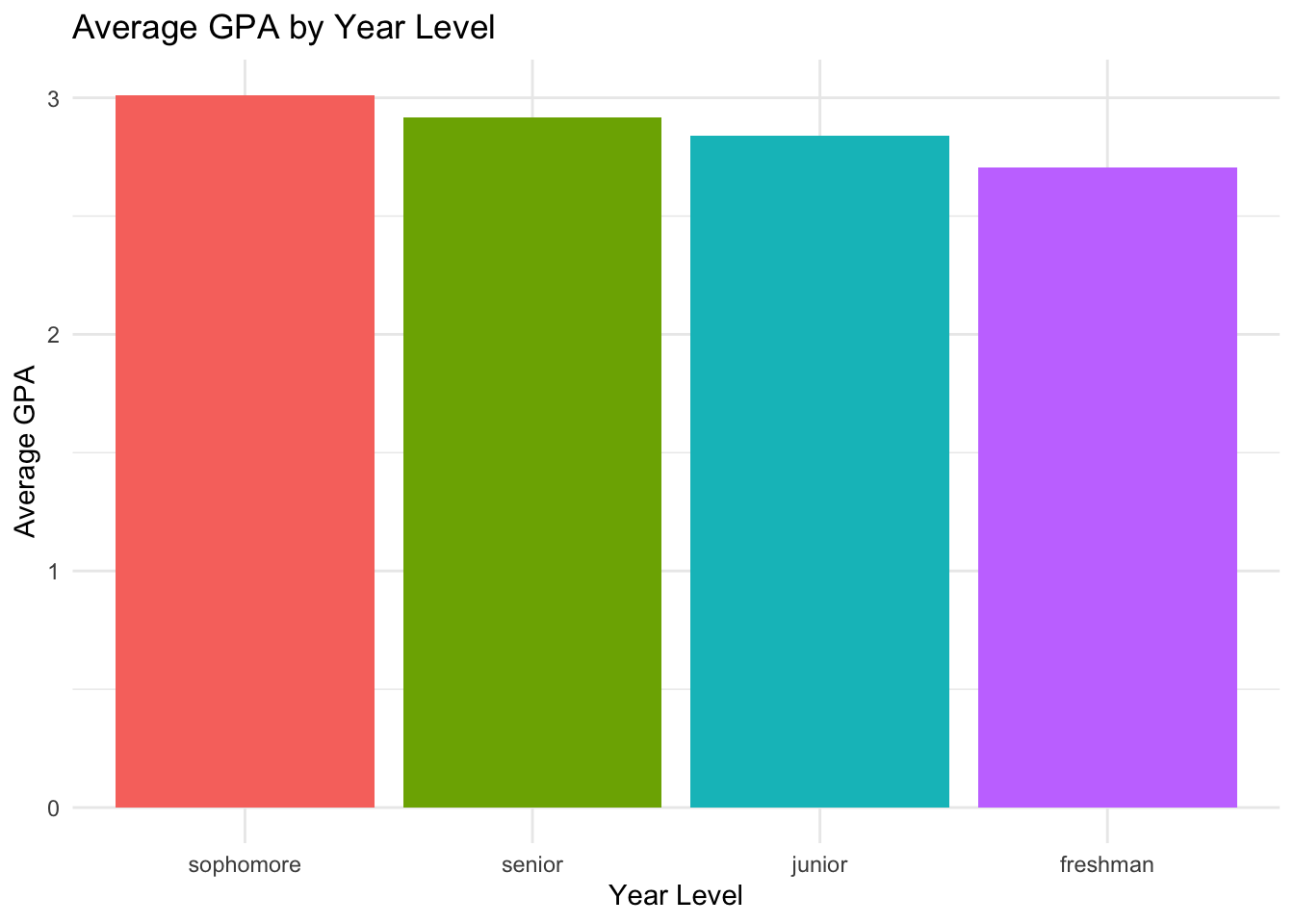
There are also ways to change labels, colors, legends, etc. For example, the legend here seems redundant, so we don’t really need it. We can remove it by using the theme() function and setting the legend.position to “none”.
student_data |>group_by(year_level) |>summarise(avg_gpa =mean(gpa)) |>ggplot(aes(x =fct_reorder(year_level, avg_gpa, .desc =TRUE), y = avg_gpa,fill =fct_reorder(year_level, avg_gpa, .desc =TRUE))) +geom_col() +labs(title ="Average GPA by Year Level",x ="Year Level",y ="Average GPA") +theme_minimal() +theme(legend.position ="none")
Practice Problems
This document contains 5 practice problems using built-in datasets from the R datasets package. Each problem requires you to work with categorical variables, create factors, and visualize the data using colored barplots with ggplot2. Some problems involve reordering factor levels with fct_reorder and summarizing data.
All solutions are provided in dropdowns—click to reveal each solution.
Task:
Use the mtcars dataset.
- Make a barplot of the number of cars by the number of cylinders (cyl).
- Convert cyl to a factor. - Color the bars by cylinder type.
Hint
mtcars %>%mutate(cyl =factor(cyl)) %>%ggplot(aes(x = cyl, fill = cyl)) +geom_bar() +scale_fill_manual(values =c("red", "blue", "green")) +labs(title ="Number of Cars by Cylinder Type",x ="Cylinders", y ="Count")
Problem 2: Barplot of Gears Reordered by Frequency (mtcars)
Task:
- Create a barplot of the number of cars by gear type (gear). - Use fct_reorder to order the bars by frequency (highest to lowest). - Color the bars.
Hint
mtcars %>%count(gear) %>%mutate(gear =factor(gear),gear =fct_reorder(gear, n)) %>%ggplot(aes(x = gear, y = n, fill = gear)) +geom_col() +scale_fill_manual(values =c("orange", "purple", "cyan")) +labs(title ="Number of Cars by Gear Type (Ordered by Frequency)",x ="Gear Type", y ="Count")
Problem 3: Summarize and Barplot Survival in Titanic
Task:
Use the Titanic dataset.
- Convert to a data frame with as.data.frame. - Summarize the total number of people by survival status (Survived). - Make a barplot colored by survival status.
Hint
titanic_df <-as.data.frame(Titanic)titanic_summary <- titanic_df %>%group_by(Survived) %>%summarise(Total =sum(Freq))ggplot(titanic_summary, aes(x = Survived, y = Total, fill = Survived)) +geom_col() +scale_fill_manual(values =c("gray", "yellow")) +labs(title ="Total Number of People by Survival Status",x ="Survived", y ="Total")
Problem 4: Reorder and Color Barplot of Hair Color in HairEyeColor
Task:
Use the HairEyeColor dataset. - Convert to a data frame. - Summarize the number of people by hair color (Hair). - Reorder hair colors by count using fct_reorder. - Color the bars by hair color.
Hint
hair_df <-as.data.frame(HairEyeColor)hair_summary <- hair_df %>%group_by(Hair) %>%summarise(Total =sum(Freq)) %>%mutate(Hair =fct_reorder(Hair, Total))ggplot(hair_summary, aes(x = Hair, y = Total, fill = Hair)) +geom_col() +scale_fill_manual(values =c("black", "brown", "gold", "darkred")) +labs(title ="Number of People by Hair Color (Reordered by Count)",x ="Hair Color", y ="Total")
Problem 5: Barplot of Species in iris with Custom Colors
Task:
Use the iris dataset. - Make a barplot of the number of observations by species (Species). - Color the bars with custom colors.
Hint
ggplot(iris, aes(x = Species, fill = Species)) +geom_bar() +scale_fill_manual(values =c("violet", "springgreen", "gold")) +labs(title ="Number of Observations by Species in Iris Dataset",x ="Species", y ="Count")
Feel free to experiment with changing factor levels, colors, and dataset summaries!