# Packages needed for this section.

library(tidyverse)
Warning: package 'ggplot2' was built under R version 4.5.2library(ggplot2)# Packages needed for this section.
library(tidyverse)Warning: package 'ggplot2' was built under R version 4.5.2library(ggplot2)We have discussed Measure of Centrality and why they are important when trying to describe a data set. There are some limitations as to what that information can tell you. For instance, consider the following two data sets :
If we examine these two variables, they look remarkably similar to one another if we only consider their measure of center.
# Create the first variable, data1

data1 <- c(5,5,5,5,5,5,5,5,5,5)

# Create the second variable, data2

data2 <- c(0,0,0,0,0,10,10,10,10,10)
If we calculate the mean and the median, we get the following :
# Calculate the means for data1 and data2

mean(data1)
[1] 5mean(data2)[1] 5# Calculate the medians for data1 and data2
median(data1)[1] 5median(data2)[1] 5Based off of this information, it would appear the data1 and data2 are similar to one another, but that is not the case. Let’s create a visualization to get a better picture of the data sets. We will make barplots for these two variables and compare them. Here is how we could create the two bargraphs and display them side by side. This will help us directly compare them.
# We need to turn data1 and data2 into data frames to use ggplot

data1 <- as.data.frame(data1)

data2 <- as.data.frame(data2)

# We will create the first barplot for data1 and save it to the variable
# name graph1.

graph1 <- ggplot(data1) +
  geom_bar(aes(data1), width = 1, fill="blue") +
  coord_cartesian(xlim = c(0,10), ylim = c(0,10))

# One item to note is that we are setting the x and y limits to be the same
# for both graphs. We are setting their limits to go from 0 to 10.
# This will make it easier to compare the two.

# We will now do the same for data2.

graph2 <- ggplot(data2) +
  geom_bar(aes(data2), width=1, fill="red") +
  coord_cartesian(xlim = c(0,10), ylim = c(0,10))

# If we want to print them off side by side we can use the patchwork package.
# It makes it easier to combine plots together into the same graphic.

# You can read more about it here : https://patchwork.data-imaginist.com

# If it is not installed, you can uncomment and run this command :

# install.packages("patchwork")

# We will then need to make sure it is loaded up and ready to use.

library(patchwork)

# We can then combine the two plots together as follows :

graph1 + graph2 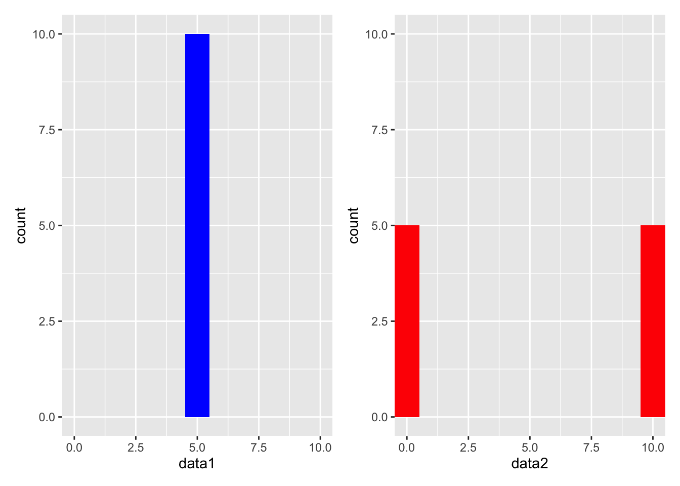
When we see these two graphs, they are clearly much different from each other. When the data sets were created, we used values from 0 to 10. The first data set was created using all 5’s, while the second data set was created using 0’s and 10’s. In other words, data1 has all of its values in the middle of our possible values and data2 has half of its values on either end of the extreme side of our possible values. So while mean and median for both data sets were the same, the data sets are clearly different from one another. This is because the data sets had different amounts of spread in them.
We do have to be careful with how we determine if a data set has a large spread or not. If we try to look at a picture of a data set, it can be deceiving whether the points are spread out or tightly bunched together. By drawing a graph with inappropriate bounds, we can make a data set look like it has more or less spread than it actually does. This is why it is important to find a method to quantify the spread in a data set. By developing a numerical value to represent the amount of spread in a data set, we can have an objective way to determine how spread out the data is.
The two example data sets we have been working with are a good example of this. Data 1 has all of its values at 5, and this means that there is no spread in the data. If a data set has values that are all close to each other, the there is “little” spread in it and it is said to have a low variability. In this case, the data1 is said to have NO variability, or variability of 0.
Data 2, on the other hand, would be said to have a lot of spread in it. It has values at both extremes of the possible values, 0 and 10. When a data set has values that are far apart from each other, then it is said to have a high variability. In this case, data2 is said to have a high variability.
This is where measures of variability come into play. They help us understand how spread out the data is. There are several ways to measure variability, but we will focus on the following :
We will calculate each of these measures for the two data sets we have been working with.
The range is the simplest measure of variability. It is the difference between the largest and smallest values in a data set. It is easy to calculate, but it is also very sensitive to outliers. If you have a data set with a large range relative to its values, then it is likely that you have an outlier in your data set. Here is how you can calculate the range for the two data sets we have been working with.
# Calculate the range for data1

range(data1)
[1] 5 5# Calculate the range for data2
range(data2)[1] 0 10The output for the range command gives us the lowest and the highest value in the dataset. The range of data1 is \(5-5=0\), which is expected because all of the values in data1 are the same. The output for the range of data2 is \(10-0=10\), which is expected because the largest value in data2 is 10 and the smallest value is 0.
While this result is interesting, it still does not give us a good idea of how spread out the data is. Perhaps there is one value that is much larger than the rest of the values, and that is why the range is so large. This is why the range is not a great measure of variability. We need to consider other measures of variability to get a better understanding of the data set.
When we talk about the spread of a data set, we are talking about the spread of a data set around the mean. The variance is a measure of variability that is sensitive to outliers. It is the average of the squared differences between each data point and the mean. Consider this data set :
The mean of this data set is 4. If we are talking about the spread of the data set around the mean, then we want to see how far each point is from the mean. We want to consider the differences between each data point and the mean. The differences are :
| data | difference from mean |
|---|---|
| 1 | -3 |
| 2 | -2 |
| 3 | -1 |
| 4 | 0 |
| 5 | 1 |
| 6 | 2 |
| 7 | 3 |
Since we are talking about spread from the mean, it would be natural to think that we should take the average of these differences (these are often called deviations from the mean). However, if we take the average of these differences, we will get 0. This is because the sum of the differences is always 0. Hopefully this makes sense, because if the mean if a true measure of center, then there should be just as much distance above the mean as there is below the mean, cancelling each other off to add up to 0.
To get around this, we can square the differences before we take the average. This will make all of the differences positive, and it will give us a measure of how far each point is from the mean. This is the variance.
The variance does have one caveat if you are calculating it by hand, and that is if your data set is a sample. If your data set is a sample, then you will need to divide by \(n-1\) instead of \(n\) when calculating the variance. This is because the sample variance is an unbiased estimator of the population variance. If you are working with a population, then you can divide by \(n\). Since we are not going to be calculating this by hand you will not be required to memorize this, but it is included here for completeness or if you take a statistics course in the future.
In terms of the mathematical formula for the variance, it is as follows :
Where \(x_i\) is the \(i^{th}\) value in the data set, \(\bar{x}\) is the mean of the data set, and \(n\) is the number of values in the data set.
We will now turn our attention to how we can calculate the variance in R. The variance is a built-in function in R, so we do not need to write our own function to calculate it. The variance function in R is called var.
We know that data1 has no variability so the result should be 0. Data2 has a lot of variability so the result should be much larger than 0. Note that if a data set has all of its values the same, then the variance will always be 0. This is because there is no spread in the data set. As soon as one value is different from the rest, then the variance will be greater than 0.
# Calculate the variance for data1

var(data1)
data1
data1 0As expected, the variance for data1 is 0.
What about data2?
# Calculate the variance for data2

var(data2)
data2
data2 27.77778
The variance for data2 is 27.77778.
FYI, this is the way we can make the measure of spread as large as possible. We can do this by having half of the values at the lowest value and the other half at the highest value.
The variance is a good measure of variability, but it is not always easy to interpret. This is because the variance is in squared units. This means the variance is not in the same units as the data, so it is hard to interpret. For example, if you are working with data that is measured in inches, then the variance will be in square inches. This is not always useful. We may want to get a measure of variability that is in the same units as the data. This is where the standard deviation comes into play.
Because of the change in units, this is why we often use the standard deviation instead of the variance. The standard deviation is simply the square root of the variance. It is in the same units as the data, so it is easier to interpret. Here is how you can calculate the standard deviation :
# Calculate the standard deviation for data1.

# It is important to point out the the standard deviation command is
# designed to work with vectors and not data frames. So let's recreate
# data1 and data2

data1 <- c(5,5,5,5,5,5,5,5,5,5)

sd(data1)
[1] 0This one is easy to see since the variance was 0, we knew the standard deviation would also be 0.
Data2 is a little more interesting because the values of the data set were not all the same. What we do know is that it should be the square root of the variance.
# Calculate the standard deviation for data2

data2 <- c(0,0,0,0,0,10,10,10,10,10)

sd(data2)
[1] 5.270463The standard deviation for data2 is 5.291503. This is the square root of the variance we calculated earlier. The standard deviation is a good measure of variability because it is in the same units as the data.However, it is not difficult to go back and forth between the variance and square root as we can simply either square the standard deviation to get the variance or take the square root of the variance to get the standard deviation.
Is there a time when we don’t want to use either the variance or the standard deviation? Yes, there is. If we have a data set with outliers, then the variance and standard deviation may not be the best measures of variability. This is because the variance and standard deviation are sensitive to outliers. This is because of what we saw earlier when discussing measures of center.
We saw that the mean is sensitive to outliers, and the variance and standard deviation are based on the mean. This means that the variance and standard deviation are also sensitive to outliers. Hopefully this makes sense because if an outlier affects a mean, then this skewed mean will affect how we calculate the variance or standard deviation. So if we do have outliers in our data set, you may want to consider using the 5-Number summary.
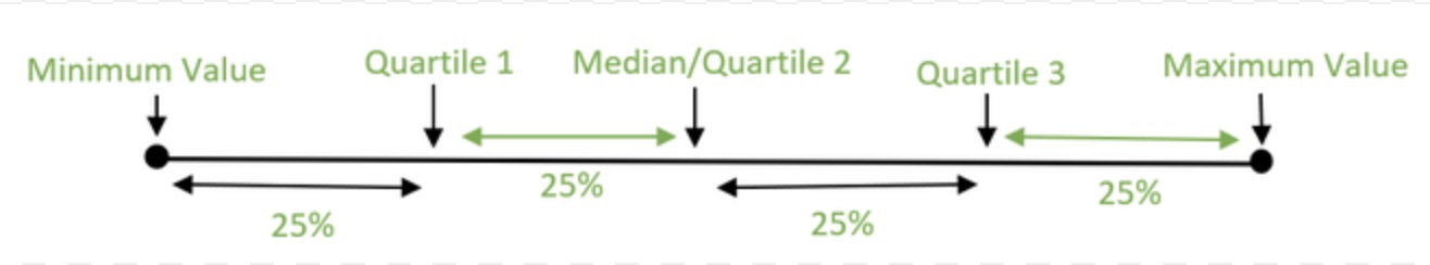
The 5-Number Summary is a measure of variability that is not sensitive to outliers. It is a summary of the data set that includes the minimum value, the first quartile, the median, the third quartile, and the maximum value. The first quartile is the value that is greater than 25% of the data, while the third quartile is the value that is greater than 75% of the data. The median is also known as the second quartile which falls in the middle of the data. There are 50% of the data above and below the median. The 5-Number Summary is a good way to see how the data is spread out across the entire data set.
Here is how you can calculate the 5-Number Summary for the two data sets we have been working with.
# Calculate the 5-Number summary for data1.

# We will use the summary( ) function to calculate the 5-Number Summary.
# This will also show us the mean of the data.

summary(data1)
Min. 1st Qu. Median Mean 3rd Qu. Max.
5 5 5 5 5 5 # Calculate the 5-Number summary for data2
summary(data2) Min. 1st Qu. Median Mean 3rd Qu. Max.
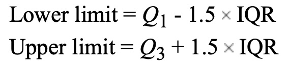
0 0 5 5 10 10 Calculating outliers is obviosuly a very important part of data analysis. There are many ways to calculate outliers, but one of the most common ways is to use the IQR method. The IQR method is based on the 5-Number Summary. The IQR is the difference between the third quartile and the first quartile. The IQR is a measure of how spread out the middle 50% of the data is. The IQR is used to determine if a data point is an outlier. A data point is considered an outlier if it is more than 1.5 times the IQR below the first quartile or above the third quartile.
Here is how you can determine if a data set has outliers using R :
# Let's create a data set to check. Let's make a data set with 20 values
# between 0 and 1000 :


data3 <- c(10, 15, 19, 27, 30, 35, 40, 45, 50, 55, 60, 65, 70, 75, 80, 85, 90, 150, 512, 1000)

# We could use the summary( ) command to calculate the 5-Number summary to
# determine Q1 and Q3, but here is another way to find them.

# If you want the first quartile, recall it is the 25th percentile
# so we can use the quantile( ) function to calculate it.

Q1 <- quantile(data3, 0.25)

Q1
25%
33.75 # If you want the third quartile, recall it is the 75th percentile
# so we can use the quantile( ) function to calculate it.
Q3 <- quantile(data3, 0.75)
Q3 75%
81.25 # Now we can calculate the IQR. From above we saw that Q1 = 33.75
# and Q3 = 81.25. So the IQR is :
IQR <- Q3 - Q1
IQR 75%
47.5 # Now that we know IQR = 47.5, we can determine if there are any
# outliers in the data set by calculating the low and high boundaries.
# The low boundary (fence) is Q1 - 1.5*IQR
Low_Boundary <- (Q1 - 1.5*IQR)
Low_Boundary 25%
-37.5 # This tells us that the low boundary for outliers is -33.75.
# The high boundary (fence) is Q3 + 1.5*IQR
High_Boundary <- (Q3 + 1.5*IQR)
High_Boundary 75%
152.5 # This tells us that the high boundary for outliers is 82.25
# Therefore ALL values between -33.75 or above 82.25 are NOT outliers, but
# anything below 33.75 or above 82.25 are considered outliers.
# Recall our data set :
data3 [1] 10 15 19 27 30 35 40 45 50 55 60 65 70 75 80
[16] 85 90 150 512 1000By inspection we can see that we do not have any values less than -33.75 which means we do not have any low outliers. However, we do have values of 512 and 1000 in the data set and these are greater than 82.25. This means we have TWO high outliers.
Because this data set was relatively small, we could easily see the outliers by looking at the data set. However, if you have a large data set, then it may be difficult to see the outliers. This is why it is important to have a method to determine if a data point is an outlier. We could use the following command to determine the outliers in the data set :
outliers <- data3[data3 < Q1 - 1.5*IQR | data3 > Q3 + 1.5*IQR]

# let's break down what is going on with this command :

# We are creating a new variable called outliers.

# We are pulling out values from data3 and storing them into the
# variable "outliers".

# Look at the command inside of data3[ ]

# We want low outliers, and that is what the first part of the command is
# looking for. We are looking for values that are less than Q1 - 1.5*IQR.

# We want high outliers, and that is what the second part of the command is
# looking for. We are looking for values that are greater than Q3 + 1.5*IQR.

# We are using the "|" symbol to indicate that we want to pull out values that
# are either (less than Q1 - 1.5*IQR) OR (greater than Q3 + 1.5*IQR).

# To sum up, we are looking at the data set data3 and pulling out values that
# are either low outliers or high outliers and storing them into the variable
# "outliers".

# The command is basically this :

# data_frame[which( data_frame < Lower_Fence | data_frame > Upper_Fence)]

# We can print off the variable to see if any values were captured.

outliers
[1] 512 1000Since this data set has two high outliers, we would not want to use the mean as a measure of center and we would not use the standard deviation as a measure of variability. We would instead report the median as a measure of center and the 5-Number Summary as a measure of variability.
The 5-Number Summary is often displayed using a boxplot. A boxplot is a graphical representation of the 5-Number Summary. Here is how you can create a boxplot in R :
# We can use the boxplot( ) function to create a boxplot.

# Recall data3 is currently a vector, so we need to turn it into a data frame
# in order to use ggplot.

data3 <- as.data.frame(data3)

ggplot(data3, aes(y=data3)) +
  geom_boxplot() +
  coord_flip()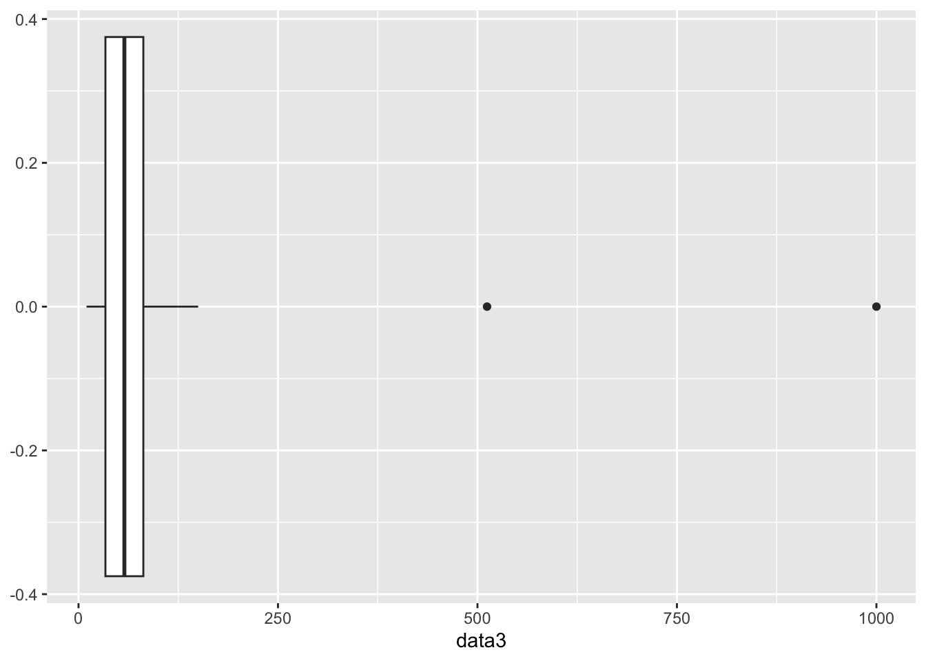
The box part of the boxplot represents the middle 50% of the data. The line on the left is where Q1 is located, the line in the middle is where the median is located, and the line on the right is where Q3 is located. The whiskers represent the minimum and maximum values in the data set that are not outliers. In other words, the left whisker goes down to the lowest value that is not an outlier and the right whisker goes up to the highest value that is not an outlier. The points outside of the whiskers are the outliers. Notice that the boxplot is displaying the two outliers we found above.
The two outliers above are causing the picture to be mashed together. Let’s create one more example of a distribution that does not contain any outliers so you can see what a boxplot looks like without any outliers.
# Let's create a new data set that does not contain any outliers.

data4 <- c(10, 15, 19, 27, 30, 35, 40, 45, 50, 55, 60, 65, 70, 75, 80, 85, 90, 95, 100, 105)

# We will turn data4 into a data frame so we can use ggplot.

data4 <- as.data.frame(data4)

# We will now create a boxplot for data4.

ggplot(data4, aes(y=data4)) +
  geom_boxplot() +
  coord_flip()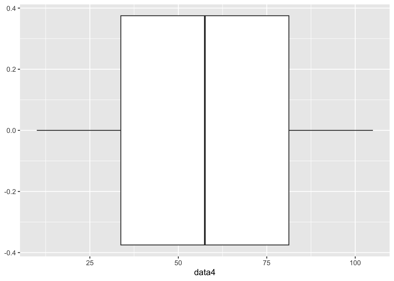
This is a more traditional picture of a boxplot to where it is much easier to see the 25% breaks in the data.
In this assignment, you will practice calculating descriptive statistics (range, variance, standard deviation, and 5-number summary), creating basic boxplots using ggplot2, and determining if the data has any outliers using the Interquartile Range (IQR). You will use built-in datasets from R for this assignment.
iris DatasetTask: Calculate the range, variance, standard deviation, and 5-number summary of the Sepal.Length column in the iris dataset.
Steps:
iris dataset.Sepal.Length column.Code Example:
# Load iris dataset
data(iris)

# Calculate descriptive statistics
range_sepal_length <- range(iris$Sepal.Length)
variance_sepal_length <- var(iris$Sepal.Length)
sd_sepal_length <- sd(iris$Sepal.Length)
summary_sepal_length <- summary(iris$Sepal.Length)

range_sepal_length
[1] 4.3 7.9variance_sepal_length[1] 0.6856935sd_sepal_length[1] 0.8280661summary_sepal_length Min. 1st Qu. Median Mean 3rd Qu. Max.
4.300 5.100 5.800 5.843 6.400 7.900 airquality DatasetTask: Calculate the range, variance, standard deviation, and 5-number summary of the Ozone column in the airquality dataset after removing NA values.
Steps:
airquality dataset.Ozone column.Ozone column.Code Example:
# Load airquality dataset
data(airquality)

# Remove NA values from Ozone column
ozone_no_na <- na.omit(airquality$Ozone)

# Calculate descriptive statistics
range_ozone <- range(ozone_no_na)
variance_ozone <- var(ozone_no_na)
sd_ozone <- sd(ozone_no_na)
summary_ozone <- summary(ozone_no_na)

range_ozone
[1] 1 168variance_ozone[1] 1088.201sd_ozone[1] 32.98788summary_ozone Min. 1st Qu. Median Mean 3rd Qu. Max.
1.00 18.00 31.50 42.13 63.25 168.00 lynx DatasetTask: Create a basic boxplot of the annual number of lynx trapped in the lynx dataset.
Steps:
lynx dataset.ggplot2.Code Example:
# Load ggplot2 and lynx dataset
library(ggplot2)
data(lynx)

# Create boxplot
ggplot(data.frame(lynx), aes(y = lynx)) +
  geom_boxplot() +
  labs(title = "Boxplot of Annual Lynx Trappings", y = "Number of Lynx Trapped")
Don't know how to automatically pick scale for object of type <ts>. Defaulting
to continuous.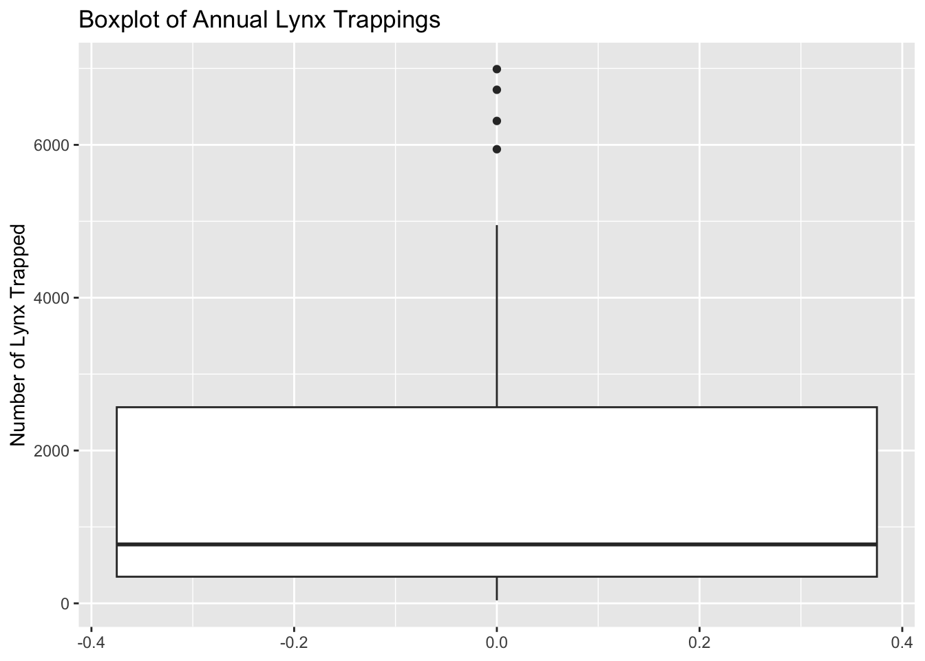
ToothGrowth DatasetTask: Calculate the range, variance, standard deviation, and 5-number summary of the len column in the ToothGrowth dataset.
Steps:
ToothGrowth dataset.len column.Code Example:
# Load ToothGrowth dataset
data(ToothGrowth)

# Calculate descriptive statistics
range_len <- range(ToothGrowth$len)
variance_len <- var(ToothGrowth$len)
sd_len <- sd(ToothGrowth$len)
summary_len <- summary(ToothGrowth$len)

range_len
[1] 4.2 33.9variance_len[1] 58.51202sd_len[1] 7.649315summary_len Min. 1st Qu. Median Mean 3rd Qu. Max.
4.20 13.07 19.25 18.81 25.27 33.90 infert DatasetTask: Create a basic boxplot of the age column in the infert dataset.
Steps:
infert dataset.ggplot2.Code Example:
# Load ggplot2 and infert dataset
library(ggplot2)
data(infert)

# Create boxplot
ggplot(infert, aes(y = age)) +
  geom_boxplot() +
  labs(title = "Boxplot of Age in Infert Dataset", y = "Age")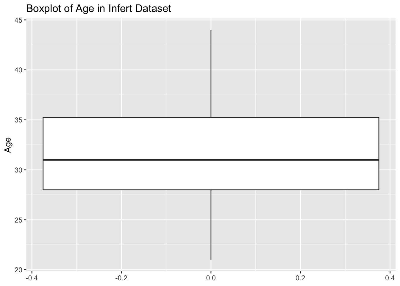
airquality DatasetTask: Calculate the range, variance, standard deviation, and 5-number summary of the Wind column in the airquality dataset after removing NA values.
Steps:
airquality dataset.Wind column.Wind column.Code Example:
# Load airquality dataset
data(airquality)

# Remove NA values from Wind column
wind_no_na <- na.omit(airquality$Wind)

# Calculate descriptive statistics
range_wind <- range(wind_no_na)
variance_wind <- var(wind_no_na)
sd_wind <- sd(wind_no_na)
summary_wind <- summary(wind_no_na)

range_wind
[1] 1.7 20.7variance_wind[1] 12.41154sd_wind[1] 3.523001summary_wind Min. 1st Qu. Median Mean 3rd Qu. Max.
1.700 7.400 9.700 9.958 11.500 20.700 iris DatasetTask: Determine if the Sepal.Length column in the iris dataset has any outliers using the Interquartile Range (IQR).
Steps:
iris dataset.Sepal.Length column.Sepal.Length column.Code Example:
# Load iris dataset
data(iris)

# Calculate IQR
iqr_sepal_length <- IQR(iris$Sepal.Length)

# Identify outliers
q1 <- quantile(iris$Sepal.Length, 0.25)
q3 <- quantile(iris$Sepal.Length, 0.75)
lower_bound <- q1 - 1.5 * iqr_sepal_length
upper_bound <- q3 + 1.5 * iqr_sepal_length
outliers <- iris$Sepal.Length[iris$Sepal.Length < lower_bound | iris$Sepal.Length > upper_bound]

iqr_sepal_length
[1] 1.3outliersnumeric(0)infert DatasetTask: Calculate the range, variance, standard deviation, and 5-number summary of the parity column in the infert dataset.
Steps:
infert dataset.parity column.Code Example:
# Load infert dataset
data(infert)

# Calculate descriptive statistics
range_parity <- range(infert$parity)
variance_parity <- var(infert$parity)
sd_parity <- sd(infert$parity)
summary_parity <- summary(infert$parity)

range_parity
[1] 1 6variance_parity[1] 1.566263sd_parity[1] 1.251504summary_parity Min. 1st Qu. Median Mean 3rd Qu. Max.
1.000 1.000 2.000 2.093 3.000 6.000 iris DatasetTask: Create a basic boxplot of the Sepal.Width column in the iris dataset.
Steps:
iris dataset.ggplot2.Code Example:
# Load ggplot2 and iris dataset
library(ggplot2)
data(iris)

# Create boxplot
ggplot(iris, aes(y = Sepal.Width)) +
  geom_boxplot() +
  labs(title = "Boxplot of Sepal Width in Iris Dataset", y = "Sepal Width")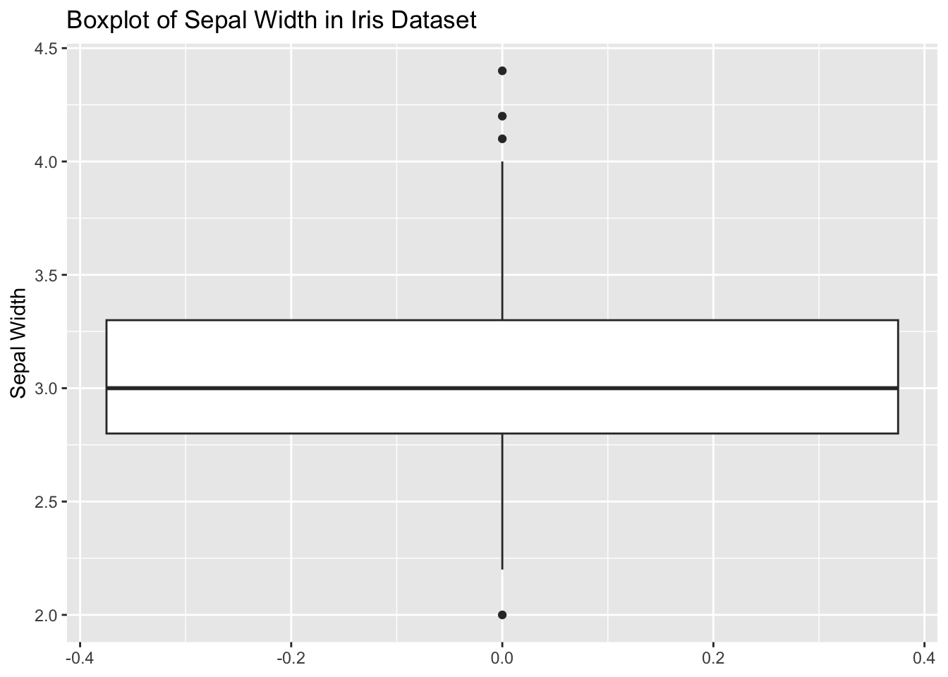
ToothGrowth DatasetTask: Determine if the len column in the ToothGrowth dataset has any outliers using the Interquartile Range (IQR).
Steps:
ToothGrowth dataset.len column.len column.Code Example:
# Load ToothGrowth dataset
data(ToothGrowth)

# Calculate IQR
iqr_len <- IQR(ToothGrowth$len)

# Identify outliers
q1 <- quantile(ToothGrowth$len, 0.25)
q3 <- quantile(ToothGrowth$len, 0.75)
lower_bound <- q1 - 1.5 * iqr_len
upper_bound <- q3 + 1.5 * iqr_len
outliers <- ToothGrowth$len[ToothGrowth$len < lower_bound | ToothGrowth$len > upper_bound]

iqr_len
[1] 12.2outliersnumeric(0)Measures of variability are important because they help us understand how spread out the data is. They help us understand the distribution of the data. There are several ways to measure variability, but we focused on the range, interquartile range, variance, and standard deviation. Each of these measures has its own strengths and weaknesses, and it is important to consider which measure is most appropriate for your data set.